Tips to own a FUTURE-PROOF & AWESOME website design

The design of a website has direct impact to the user experience. A poorly designed website is most likely to get visitors to give up in completing an action, such as purchase a product or signup a mailing list. Generally, if the site is having snail loading speed or is difficult to navigate, 90% of visitors will leave without. If you are not getting the results that you want from a webpage, such as increased conversions and decreased bounce rates, evaluate the design. Here’s a few bad elements we noticed on other websites. Try to avoid repeating any of these five bad elements of bad website design.
The average website owner may not understand the differences between good and bad web design, which causes a lot of websites ended up with terrible and inefficient designs.
While design trends constantly change, there are basic elements of a website that remain universal, including:
Users should not getting lost in how to find a page within your website. Everything should be well organized, with simple menus and navigation features.
A clean layout is always recommended. If the page is packed with information, graphics, and video, it takes longer to load and becomes confusing to read.
Compatibility is less of a concern, as most sites now use responsive designs that conform to the size of the user’s screen. However, there are still some websites that is not mobile friendly which is difficult to navigate in different resolution/devices.
The visual appearance of the website is very subjective, as everyone has their own style. Regardless, you need a design that is suitable according the industry. For example, a overly hyped graphics may not work well for a manufacturing site, they may work on a site for a creative agency site.
1. Websites With Unclear Message
One of the worst design element that I notice is not providing a clear message relevant to the business of your website. Users should immediately know what you are doing in your website and what you are selling.
The site CyberDsignClan isan example of a website without a clear message. You simply see a large graphic that reads, “skip intro.” After clicking on the page, the real homepage loads, which is just as confusing.
This will causes frustation to the visitors. To learn more about the product, visitors need to scroll through the page or click on other links.
Everything that appears on the page before users need to scroll further is the most important element. This is the area where the name of the business and some indication as to what they sell should be included. The top of the page should also offer some type of navigation.
Website visitors form opinions about the business within seconds. If visitors need to scroll through the page to find out what the company does, they will likely leave the page.
2. Too Many Elements Mixed up in the Page
Other than a clear message, the site should have a clear layout. If the page is cluttered, it will be difficult to navigate, causing visitors to leave.
Arngren.net is a good example of bad design. This messed website contains listings spread everywhere with no proper structure. The listings are not assigned into categories and they are just appearing here and there.

3. Pages with No Mobile Optimization
Most internet traffic in the world now comes from mobile devices, yet many websites are still built for desktop computers only. If the website is not responsive for mobile devices, most visitors will not get a good user experience.
Many sites now include responsive design, which allows the web page to adjust based on the screen resolution of the user’s device. The site may also hide elements, change fonts, or remove backgrounds when a smaller screen is detected.
These details allow the site to work on any device. While responsive designs are common, there are still many sites that are unreadable on mobile devices.
Almost all the examples already discussed do not have a responsive design. Deque University has an example of non-responsive web design.

If you are reading this in your web browser, try visiting the site and adjusting the width of the browser. As the browser window gets smaller, the page does not change its layout. The text becomes impossible to read without scrolling to the right.
If you want to see an example of responsive web design, check out our website https://www.etctech.com.my/ :D
4. Lack of Simple Navigation and Links
When visitors reach a site, it should be hassle-free in browsing the menu and looking for the information that they want. For example, http://www2.pnwx.com/.
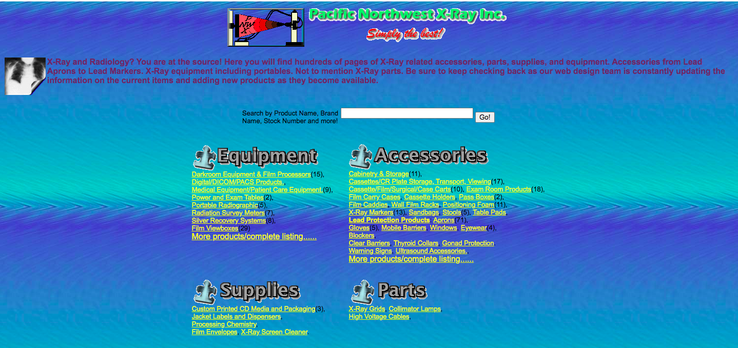
The site itself does not have navigation button which visitors might get lost during the surfing. Also, the color of the word and the background is not having a good contrast which makes a bad experience.
5. Unreadable Text or Un-clickable Buttons
Due to the demands on the web browser, the menu on the previous site is almost un-clickable. This is also a problem when sites are not optimized for mobile devices. When the elements do not adjust for the smaller screen, they may overlap or become too small to read.

Avoiding this problem is easy if you complete detailed testing before launching your website. Use emulators or software to emulate how your site appears on various mobile devices, including the latest smartphones and tablets.
ETC Tech is a leading web design company in Malaysia with an extensive portfolio of remarkable results. Our web design services and mobile app development services aims to help you and your business to grow.

ETC established since 2010 with a group of digital enthusiasts who has great passion towards programming works. We called ourselves as "programming factory" as we produced 200 over websites or apps every year to help businesses transform from offline to online.
Copyright © 2026 Etctech Global Sdn Bhd 201601041370 (1212312-M) | Best Website Design Company Malaysia - All rights reserved.